1. User Journey
First, think how your user will be experiencing from the beginning of the app, what they would normally expecting from the interaction. This process helped to decide how the app’s user experience might be designed to fit in with a feeding routine.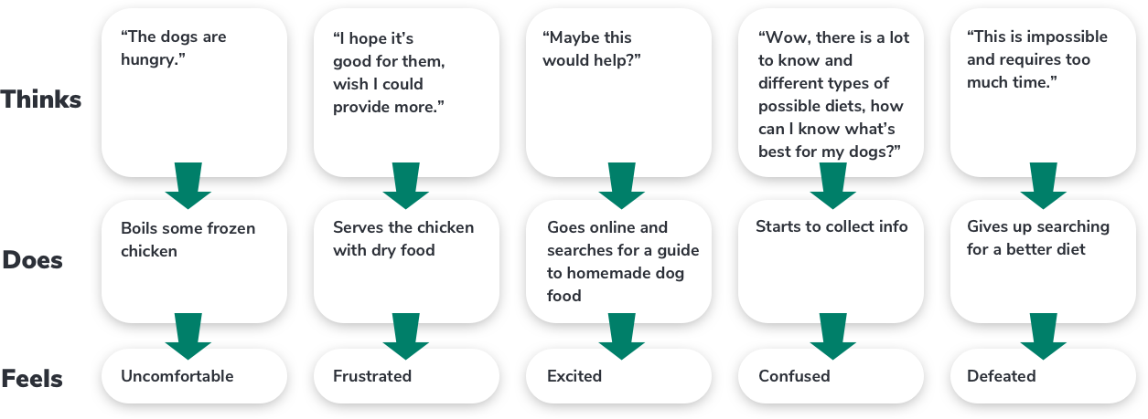
2. Jobs To Be Done
One of the most powerful tools we used is a JTBD form. Instead of focusing on what the problem is or what the users want, we ask ourself why they need it. By understanding why people might want this app it increased the chances of making a truly valuable product.
3. User Flowchart
Up until now we had a vague idea of how the app will function. Mapping the basic flow of the app forced us to figure each step on the path the users will take throughout the solution. We first sketched it on paper and then digitally rendered it.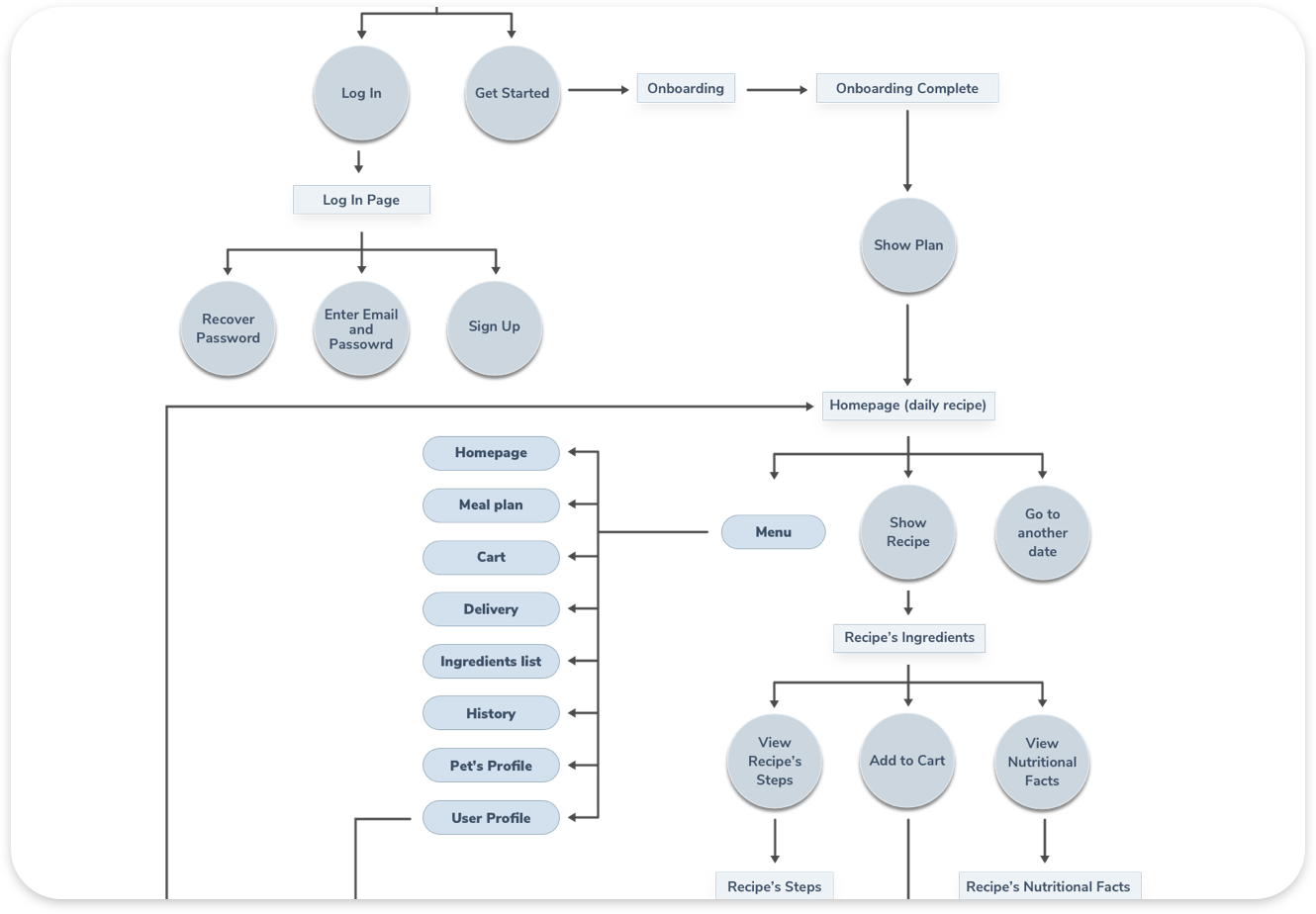
4. Sketches
This was the first step to help us outline the app and visually imagine it.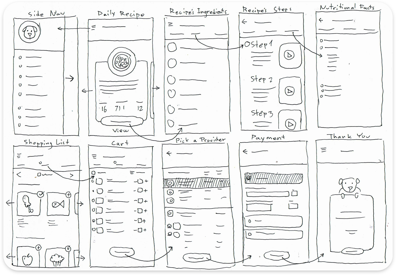
5. Wire-frames
This visual guide represents the skeletal framework of the app. It helped us arrange the interface elements while we focused on the functionality rather than what it looks like. Moreover, the simplicity of wire-frames allows us to quickly test ideas without diving into the details.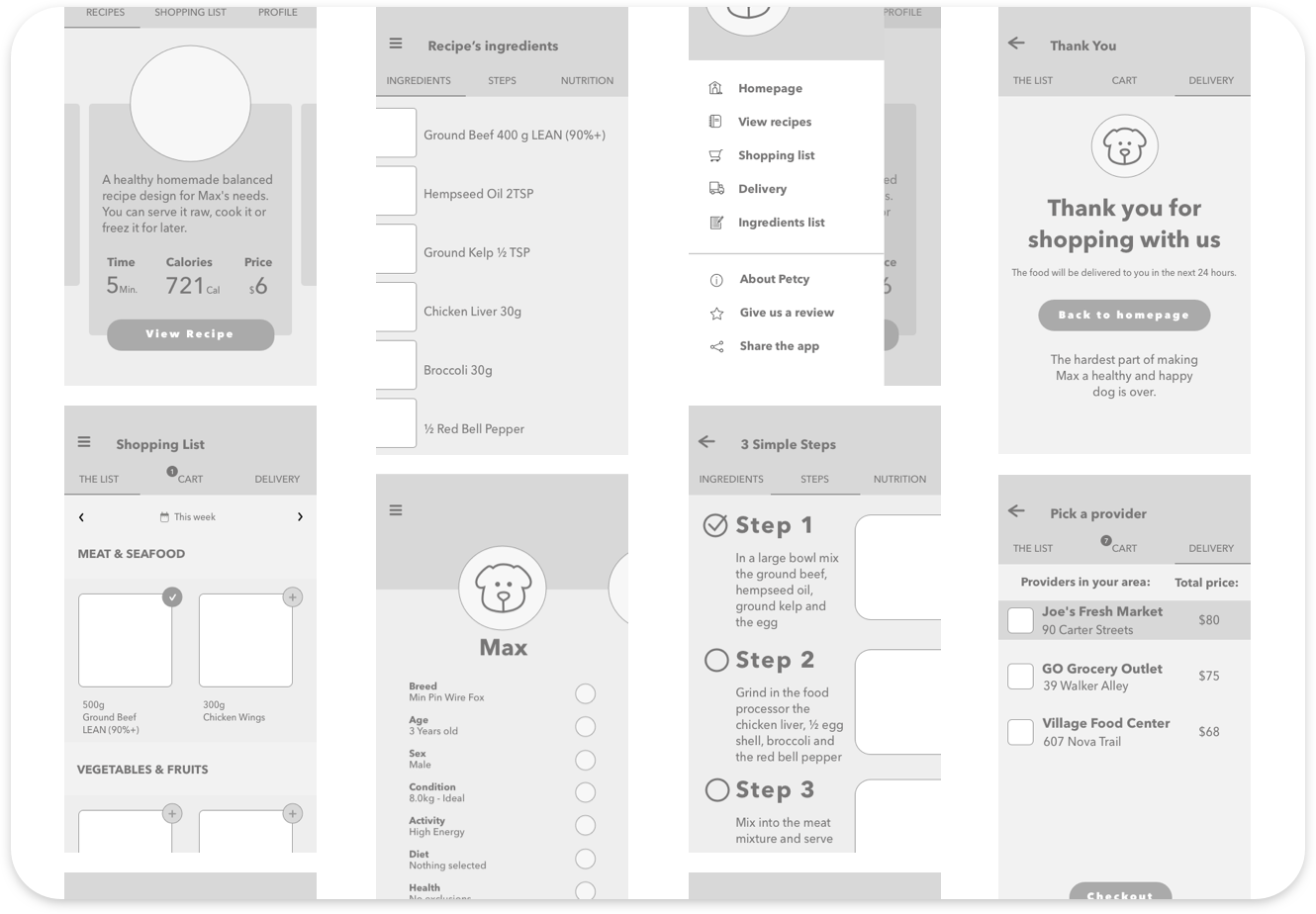
6. Storyboard — Using The App
We created a storyboard describing my user’s experience with the app. This is a great tool to explore how the product will be used in a larger context, as if it was a part of a bigger narrative. It’s an effective and inexpensive way to capture, relate, and explore the app in a real world setting. This study helps understand the circumstances and the larger context in which the app will be used.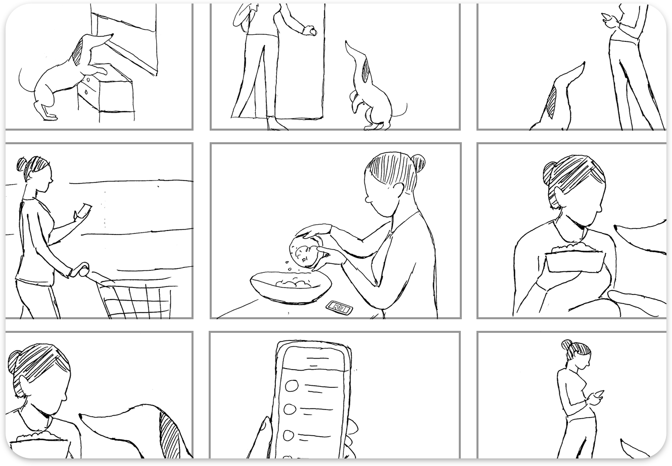
Visual Research
1. Inspiration Board
Before getting started with the visual design we create an inspiration board. The purpose was to learn about the visual world and gathering inspiration from other pet and nutrition apps.
2. Iteration
Next we explored different design possibilities: From each repetition of the design we learn something that we can use for the next iteration.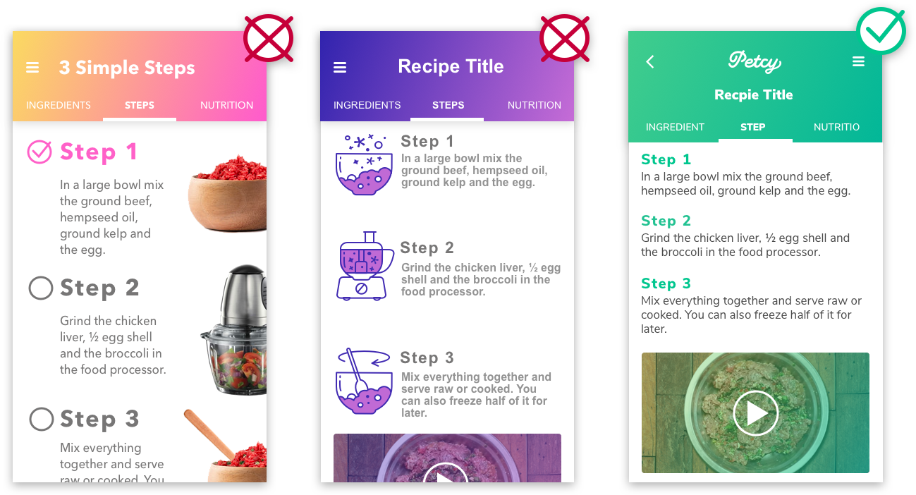
3. Color Palette
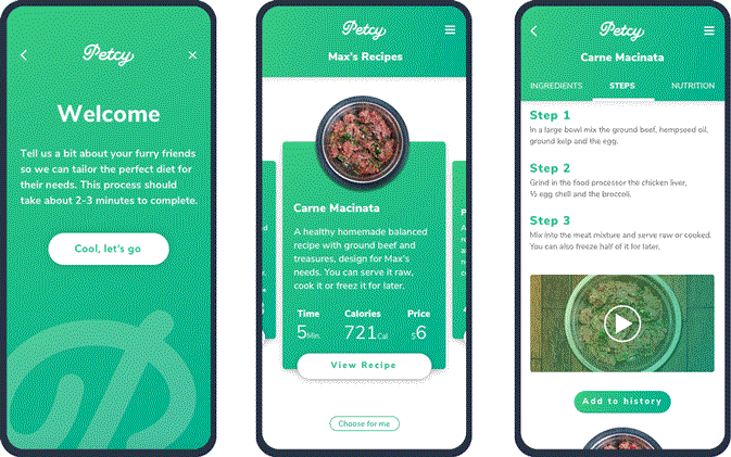
Next you need to decide which color palette that suit your app or your corporate identity. For example, green palette that symbolizes nature, life, health, youth, spring, hope, renewal, growth, rest and relaxation. Hence, a green color palette is fitting for an app that promotes healthy and natural food. Additionally, we used grey for the text and and included a great deal of white to give a calm and clean appearance.
4. Typography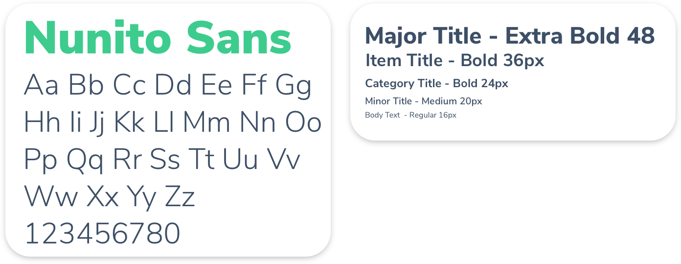
5. Icons & Illustrations
The illustrations and icons are an important part of the design. They communicate ideas and concepts that should not and sometimes cannot be communicated with words. Furthermore, they allow consistency of the visual aesthetics that help build the users’ trust and produce moments of delight.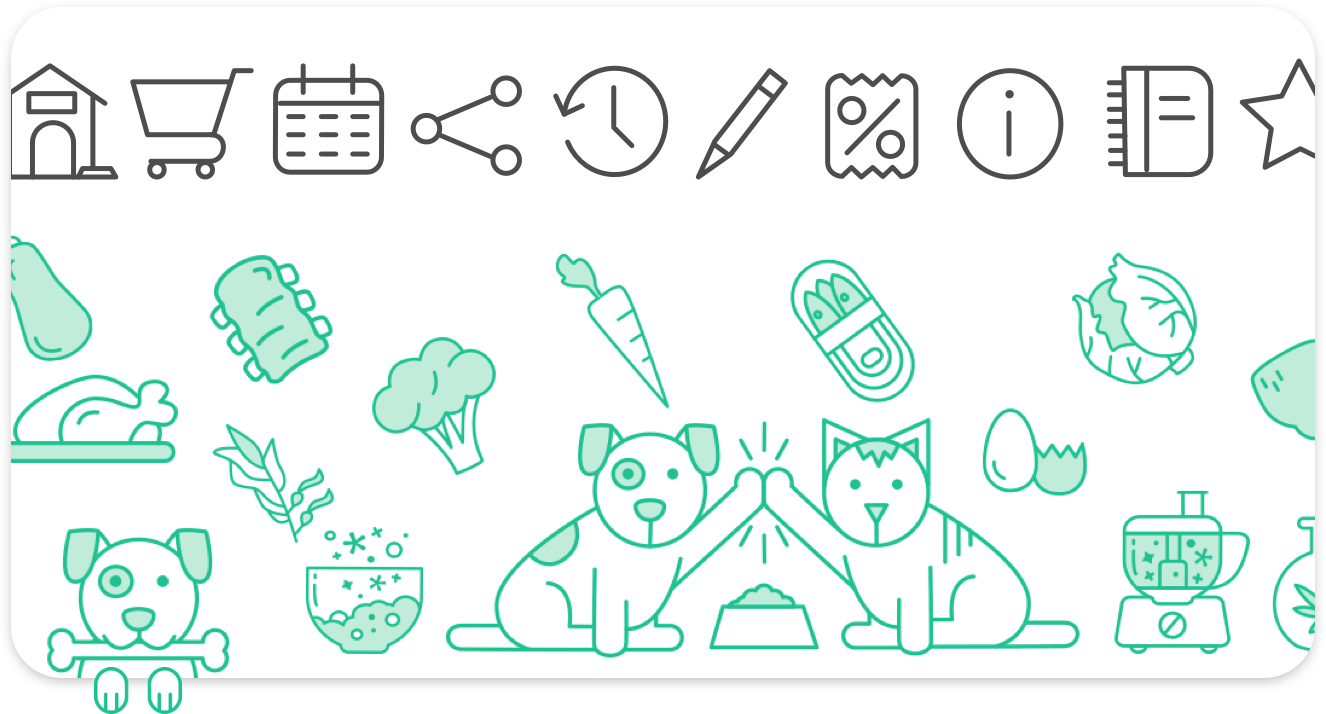
6. Naming & Logo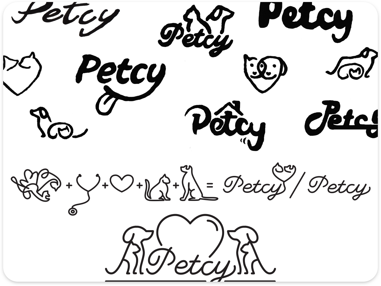
7. Micro-Interactions and Animation
One of the last things we did was to explore how motion will be implemented in the app, helping us to grasp the app’s flow and functionality on the deepest level.